Pi by Paytm
OVERVIEW
Pi by Paytm started as an internally developed tool called Maquette which used to manage risk across all core businesses at Paytm. Maquette was a powerful rule engine and decisioning software that determined the risk level of every transaction. Realizing the potential for monetization, Paytm decided to market this out as a tool for other financial organizations to use to manage their risk. With a full rebranding and a large sales push, Pi by Paytm was born.
Since Maquette was originally software designed and developed by engineers for engineers; it was steep learning curve for anyone who wasn’t one to be able to use the interface. I joined in June 2022 to lead the design effort in creating an intuitive interface that was actually marketable to external customers.
With the rebranding effort having been done, I set out to create a new design system with the goal of marketability, onboarding, and reduction of the learning curve for new users. Since the marketing effort had already begun by the time I joined, I was under a tight timeline to deliver. We decided on a agile development process that saw incremental design updates to different parts of the UI every week. Instead of user testing, we implemented Smartlook to inform us of existing usage patterns to help dictate the direction of the design.
As new designs were released, we gathered instant feedback from our existing customers and made changes on further iterations. By the end of 2022, we had fully completed the redesign and had begun implementing new features requested by our customers.
ROLE
Senior Product Designer, Design System, Product Research, Rule Engine Logic, Prototyping, Testing, QA, Hiring
2022 - Ongoing
Project Brief
As the marketing effort was already underway when I joined, there was very limited time to learn the product and make any meaningful usability changes to the flows around rule creation and customization. I instead focused on creating a new design system to facilitate a broad reskinning effort, matching the quality of the marketing material. I learned about the product during this process and was able to implement some quality of life improvements as well as brainstorm potential improvements to the user flows in future iterations. With the plan in place, these are the four areas of focus:
DESIGN SYSTEM
The rebranding effort had provided a new logo, typography, and a colour palette. I set out to create a new design system utilizing those effort and updating all interactive elements accordingly.
I also took this chance to implement quality of life improvements around modularity in modals, filtering, and table controls. The main navigation menu also saw a change in the organization of verticals, newly labelled sections as well as multilingual support.
QUALITY OF LIFE
As I worked to reskin Maquette, I was able to uncover many areas where quality of life improvements can be easily added. I implemented a more robust search and filtering system for discovery and searching through content.
Through my discovery process, I found that the current users of Pi are typically power users with an engineering background. I made efforts to improve their user experience by reducing the number of clicks per action, increasing information density, and providing more visual hierarchy to differentiate information importance.
RAPID ITERATION
With existing customers on the platform, I had a focus group at my fingertips. I was able to schedule biweekly meetings with team members to test out and refine prototypes. Having real users easily accessible to me allowed me to empathize with their frustrations and also discover easy-win solutions to improve their productivity and workflow.
COMPETITIVE FEATURES
The sales team needed Pi to be competitive as a product. I did a deep-dive into US-based competitor products such as Datavisor and Stripe to discover highlight features that we had yet to have solutions for. This discovery process also allowed me to really figure out what was and wasn’t working for users on their platform as well, so we can avoid similar usability issues.
Before & After
Here are just a few examples of improvements I have made to the Pi Risk Platform.
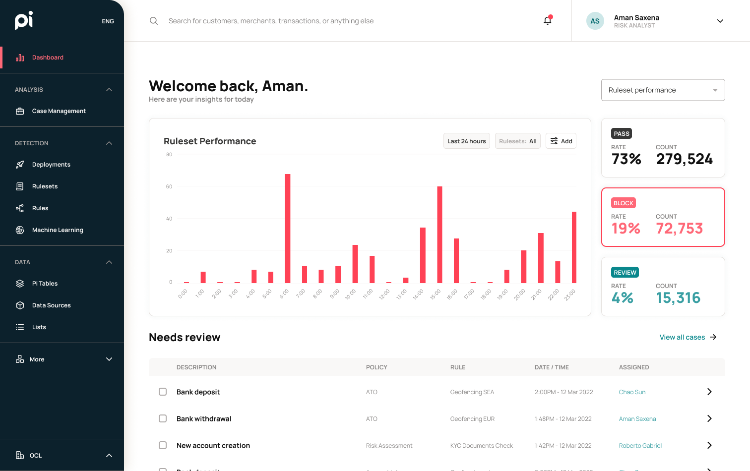
Dashboard
The dashboard saw quite a lot of improvement. I brought the most useful information to the risk operators to the forefront which allowed them to have a quick overview the moment they log in and quickly discover their immediate priorities. With modularity in mind for a phase 2, each section was designed in blocks that can be repositioned according to different user profiles. This would allow for more flexibility and customization for stakeholders.
Old
New
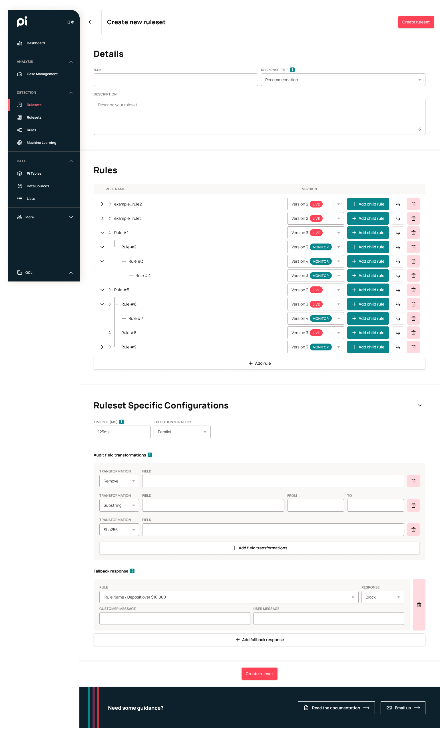
Rules
For the rules page, I improved on the use of space by splitting the content area 50/50 and displaying rule information on the right-hand side. This made better use of the space and allowed risk operators to quickly check through different rules by reducing the need to return to the rule list page.
Old
New
I also improved upon the filter system. The previous list of dropdowns caused a reload of the page with each selection, which increased latency and strain on the system. I added a filter menu that lets users select all of their options, as well as multiple options within each category before applying it all at once to the page.
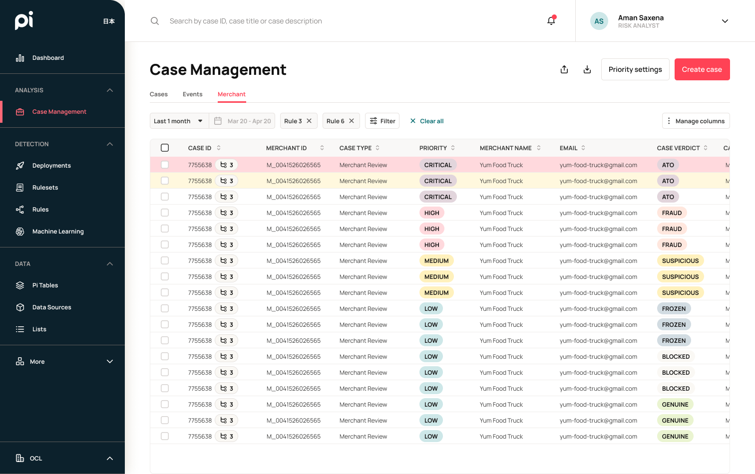
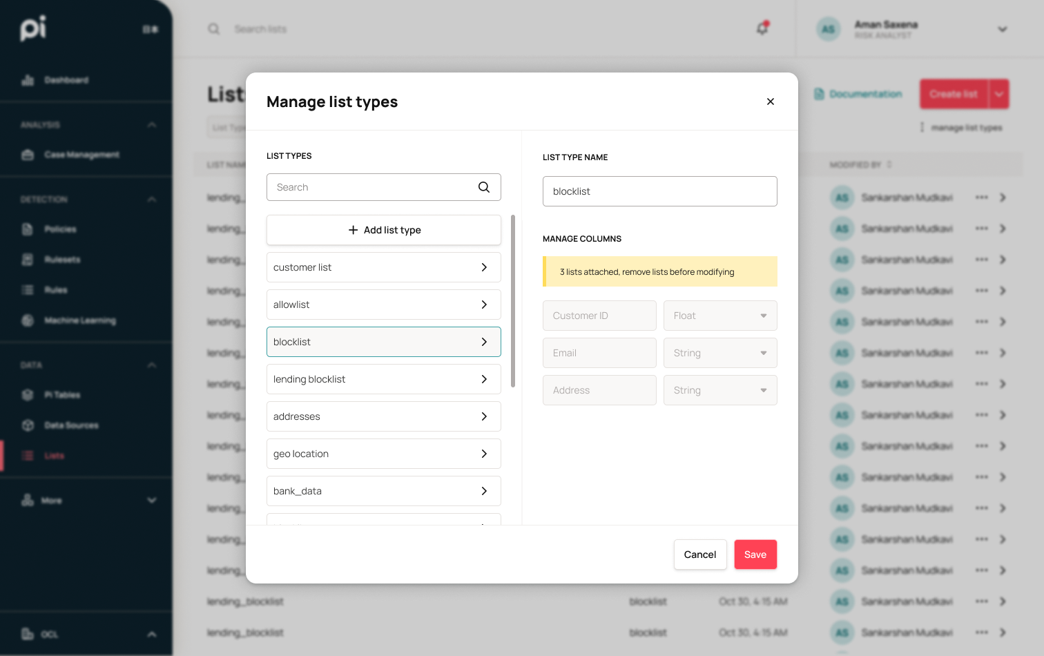
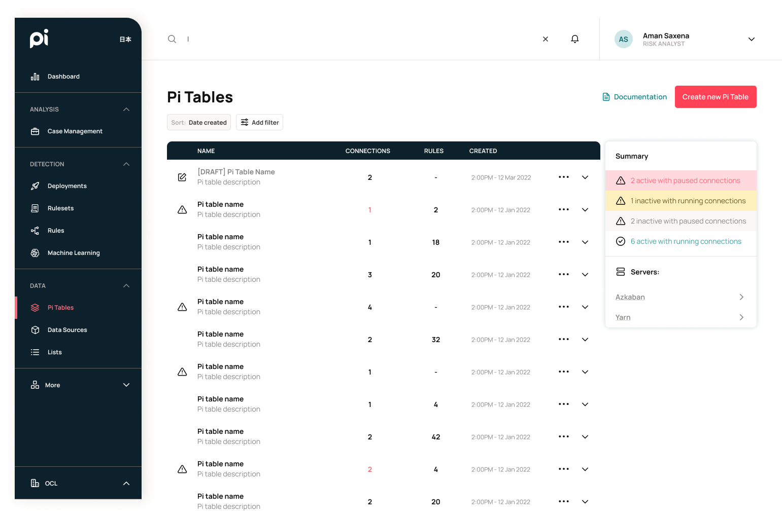
Pi Tables List
Here is an example of a page that was mostly just improved by the design system. I added a filter menu to for easier browsing and searching as well as improved on the data readability by only using symbols to mark tables that need attention.
Old
New
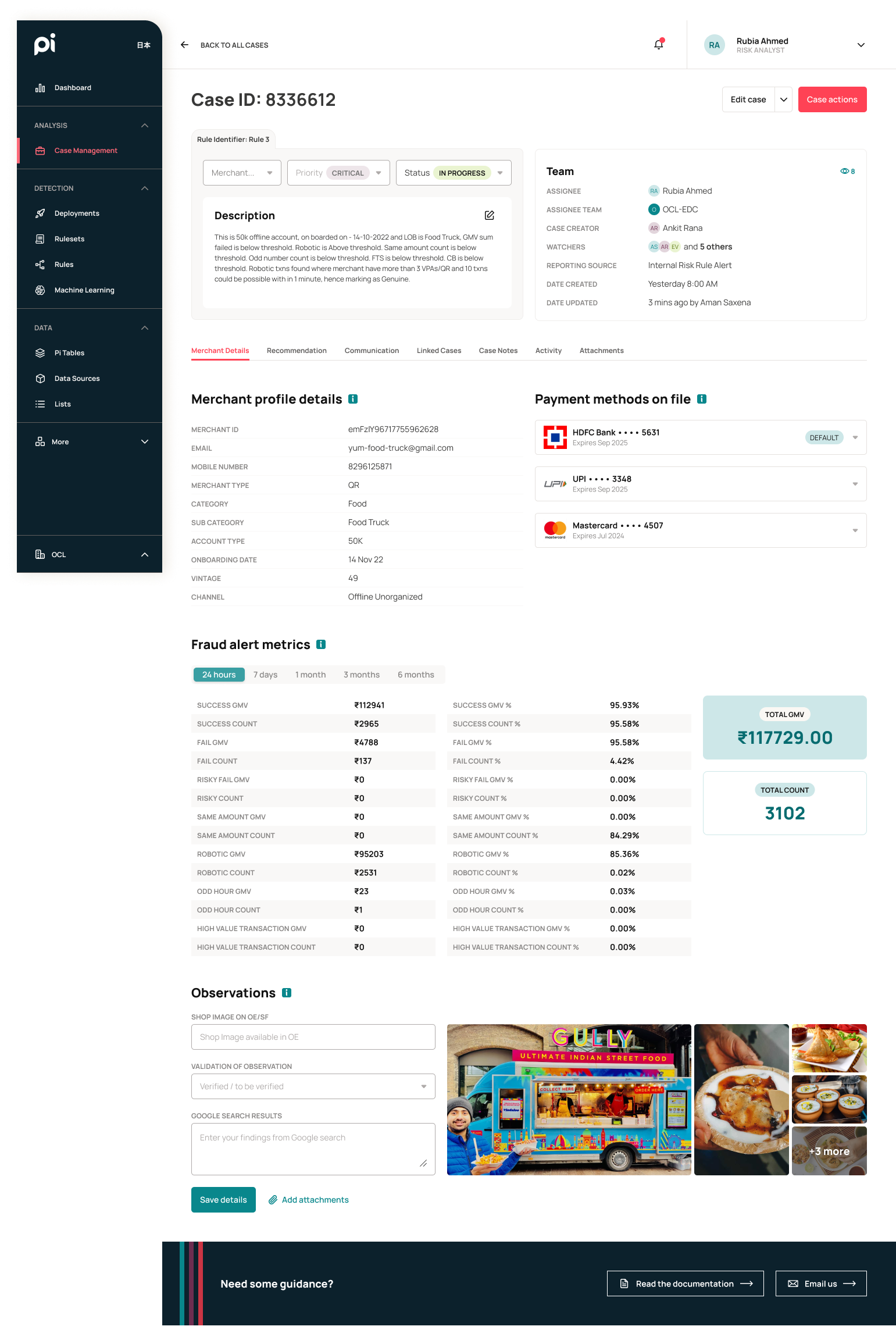
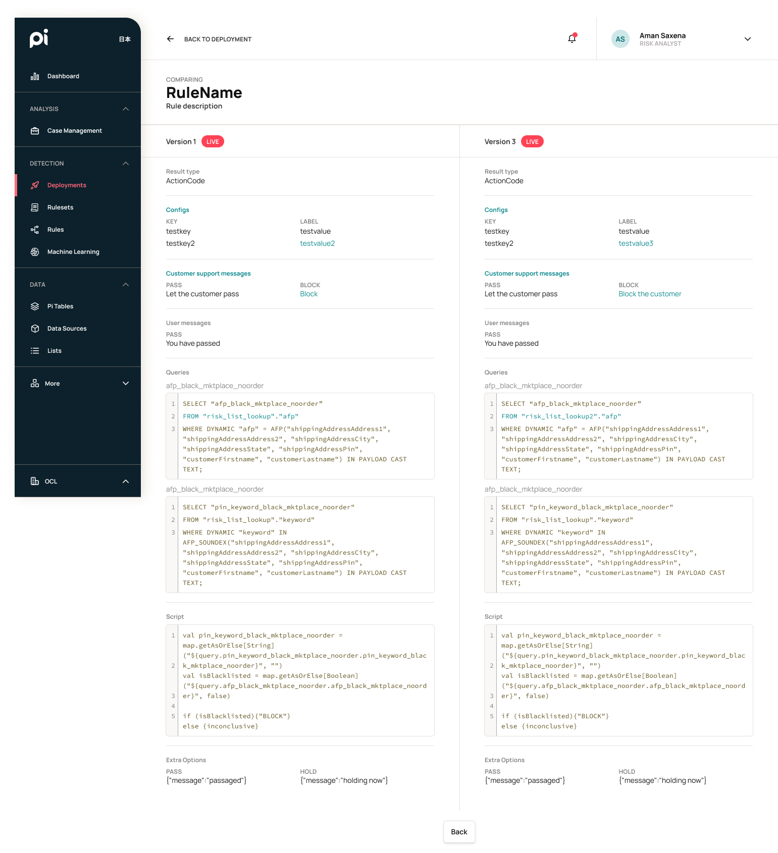
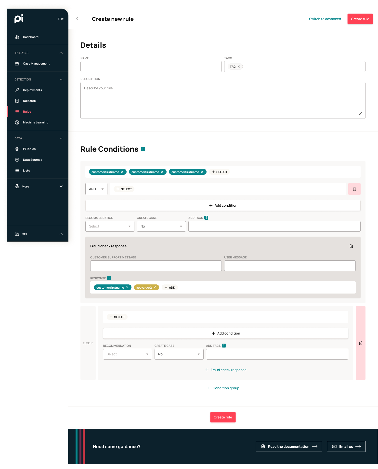
Case Study: Rule Creation
One of the major goals of this redesign is to lower the learning curve for new users as we onboard new clients. Originally, creating rules required coding ability as well as a general understanding of database structures. By removing that requirement, we can lower the cost of training risk analysts, which will help provide a more enticing product to potential clients.
The way the current system works was that an API call was made to obtain a payload from the client (ex. bank, merchant, etc.) This payload would contain transaction data (ex. customer name, account, amount, etc.). There is an existing database within the system which contains historical data from which these payloads can be compared against. The rules make comparisons between payloads, payload and the database, or just pre-defined variables. Once a comparison is made, a response can then be sent back to the client through the API. This response would usually contain an action (PASS, BLOCK, REVIEW) or a calculated variable.
Simplified diagram for API ingestion and response
I took inspiration from coding academy classes for kids and created a logic-based system for creating rules. Rules are created with a combination of variables, payloads, and operation pills. The order of the pills determines the logic for the rule. Once the rule conditions were validated and checked, a response can be determined and sent through to the API. This is how the new interface I designed was able to emulate the Javascript logic needed to write a rule.
Rule Conditions Flow
One of the fundamental key pieces to this design is that we put in logic to determine what would be the potential next pill. For example: If a variable or payload was added, then the next pill should be a operation. If the variable or payload was a string, then the operations would only consist of = or !=. The next pill after the operation would also rely on previous pills to determine whether it should be a boolean or an integer. We also have logic that marks the end of a condition, which is usually dictated by an = or != operator. Rule logic can be layered with AND/OR functions as well as additional ELSE IF condition groups. This enables our clients to create rules to be as complex as they need.
Variable selection modals
Examples of rule conditions
Prototype
Below is a clickable Figma prototype showcasing both basic and advanced rule creation.
Project Showcase