FansUnite Sportsbook
OVERVIEW
The FansUnite Sportsbook is the first product after the merger between FansUnite and Askott Entertainment. FansUnite Sportsbook is an evolution of Askott Entertainment’s Esports Betting Platform utilizing their existing iGaming technology and prowess. The goal is a whitelabel sportsbook product that can adapt across multiple gambling jurisdictions and service a global audience.
As the sole designer at the beginning of this project, I developed the design system and a scalable framework to make it easy to add new features and verticals. The design system also intended for future designers to easily pick up and add new features. As our development team grew, I was also in charge of expanding and building up a design team to continue pushing new features and verticals into the Sportsbook.
In recent news, the sportsbook alongside the chameleon platform was acquired by Betr for $10M CAD.
ROLE
Design Lead, Product Research, Design System, Visual Design, Prototyping, Testing, QA, Hiring
2020 - 2022
Project Brief
The goals of this project are quite ambitious, so we must have a solid framework and design system in place at the beginning. To achieve this, I grouped my goals for the design system into four main areas.
CUSTOMIZABLE
This is a whitelabel product that is meant to be sold to third parties. The product must be easily themeable and branded to facilitate for quick turnarounds once deals are made.
Different clients also serve different markets and regions. They may not want all of the features and verticals we offer, for example, an esports-focused sportsbook may not want our sports or casino offerings. Thus the design must facilitate for these verticals and features to be turned on or off.
ADAPTIVE / ITERATIVE
The project managers have created a long roadmap of verticals and features they want implemented. Along with client requests and feedback, it quickly became a never ending list of requirements.
However, we can't afford to get stuck in development for years and we must launch the product in a realistic timeframe. The framework must be able to easily adapt for these new features and verticals so we can launch and then iterate on the product over time.
SCALABLE / RESPONSIVE
Due to this product serving different markets and user demographics, we also have to facilitate for a wide range of screen sizes. Seasoned bettors are known to use large displays and potentially even multiple monitors; whereas casual bettors are likely going to be betting on their mobile devices.
Designing the site to be responsive from the beginning is significantly easier than trying to adapt to new resolutions after a product has been built.
GLOBALIZED
Since we have obtained licenses in multiple gambling jurisdictions, we can accept clients from all over the world. This means we have to adapt for different languages and even different page layouts.
Different regions also like to bet on different types of markets and incumbent bettors are already familiarized with the way markets are laid out in their region. A sportsbook layout that isn't catered to the region it serves may be dead on arrival. It is essential for our product to be able to adapt.
Competitor / User Study
The most noticeable pattern when you look at traditional sportsbooks is the staggering amount of information that is displayed to the user on one page. We had a hypothesis that this may be detrimental in attracting new users who are unfamiliar with sports betting. We conducted a focus study comparing existing sportsbooks with vastly different layouts and information densities.
We chose four different sportsbooks catered towards esports and sports with differing amounts of information density
Bet365
Sports-focused
High Density
PointsBet
Sports-focused
Low Density
GGBet
Esports-focused
High Density
Unikrn
Esports-focused
Low Density
We gathered 100 participants and categorized them into 3 groups: New Users, Casual Bettors, and Seasoned Bettors. We asked them to navigate around on these sites and then give them a rating based on the scale below, and also provide some insight on the reasons behind their rating.

RESULTS
On this sliding scale, the sportsbooks get a full score of 6 points if the participant likes it, and 0 points if the participant would avoid it. With 100 participants, the total score will be out of 600 points.
Bet365

PointsBet
GGBet
Unikrn
New Users | Casual Bettors | Seasoned Bettors
We found that information density did intimidate new users from wanting to register, but also discovered that quite a few seasoned bettors really wanted to be able to see as much information as possible so they can make the most informed bets. Casual bettors did not seem to mind the information density that much because they’ve seen it before, but they also did appreciate a more focused user interface. Perhaps it is because esports betting is still in it’s infancy, but we found that our esports bettors did not care as much about information density as the sports bettors.
Gathering Insight / Product Roadmap
From the user study, we identified a few high-level pain points from our competitors:
Initial Impression / Onboarding
The user should not be intimidated by the site on first impression as it becomes a barrier to entry. Information density can be gradually increased instead of overloading the user all at once.Discoverability
Site hierarchy and navigation should be logical and easy to discover. Too many pathways at once can lead to user confusion and frustration.Understanding
The amount of symbols and specific terminology used on traditional sportsbooks is overwhelming. Reducing the learning curve will allow users to use the site to it’s fullest potential in a shorter amount of time.
Working with the project managers, an initial design roadmap was created for the MVP. This initial roadmap was intended as just rough guide and the product is intended to continuously evolve over time.
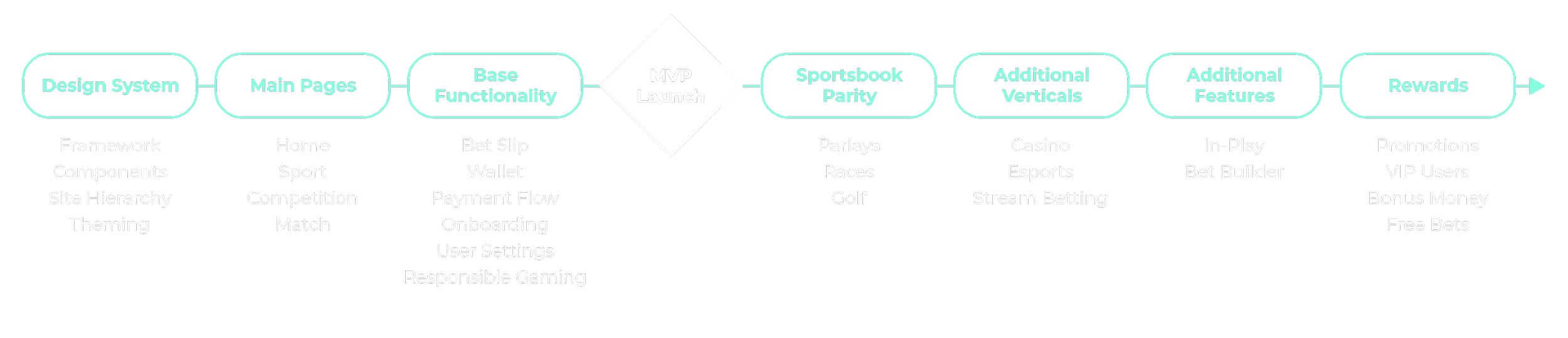
Design System & Prototyping
This stage is where we start to tackle the goals in the project brief. This is quite an extensive project so I can only show small snippets of the full design system and overall design of this project.
COMPONENTS
I started by creating a library of generic components which I could use as the basic building blocks for more complex components. These include elements like field entries, dropdown menus, checkboxes, toggles, buttons, iconography, etc.
With these base components, I started building more complex ones such as the bet cards, which need to exist in various states:
Complex components can also be combined together for larger components. Here is an example of some of the betslip components:
Here is what a betslip flow may potentially look like:
The important thing is that these components can be modified and changed as we target different regions. The card layout is intentional as it gives the content area modularity, allowing us to offer customized layouts to our clients in the future.
FRAMEWORK
The components were designed along side the overall framework. We required the site to be able to adapt as we added new verticals and features, so we went with a relatively standard top bar design with optional sidebar navigation or components.
With a framework in place, we decided upon a site map so we can lay out the navigational hierarchy on the pages.
We also required the web app to be fully responsive and adapt well to different screen sizes. We created breakpoint rules that apply to various components, padding, and fonts at various screen sizes from mobile devices all the way up to ultra-wide displays. These rules involve the use of dynamically adaptive columns that have a minimum and maximum width and can expand or contract as the resolution changes.
EXCERPT FROM BETSLIP USER STORIES
I want to make a single bet
I want to make a combo bet
I want to make a system bet
I want to make multiple combo bets at once
I want to combine bets within the same event
I want to bet both ways on a market
I want to bet while an event is live
I need to be aware of odds changes for markets in my betslip
I just want to accept all odds changes without fuss
I want to see a receipt before I confirm my bets
I want to track the score of a live event while I bet
USER STORIES
As the various components and framework came together, the project managers had generated extensive lists of user stories for each feature. The user stories are essentially tasks or goals that the user may want to accomplish while using the app. These user stories were used to test the designs to ensure that they enabled the users to complete those tasks. On the right is a snippet of what those user stories looked like.
Since we were on a time constraint and we couldn’t test the user experience for all of them, we picked and chose specific stories to mock up prototype flows for. These prototypes were used to conduct user studies to validate the designs and observe how some of our potential users attempted to navigate through the site and achieve those specific tasks.
Below is an example animation of Bet Builder and the user story:
”I want to combine bets within the same events in the same betslip”
THEMING
Since this is a whitelabel product, the app has to be able to be easily themed and branded for different brands. I developed a simple colour palette that can be easily swapped to tackle both dark and light colour themes.
I did the same with typography as well.
Swapping these values can result in drastically different results. Here are some examples:
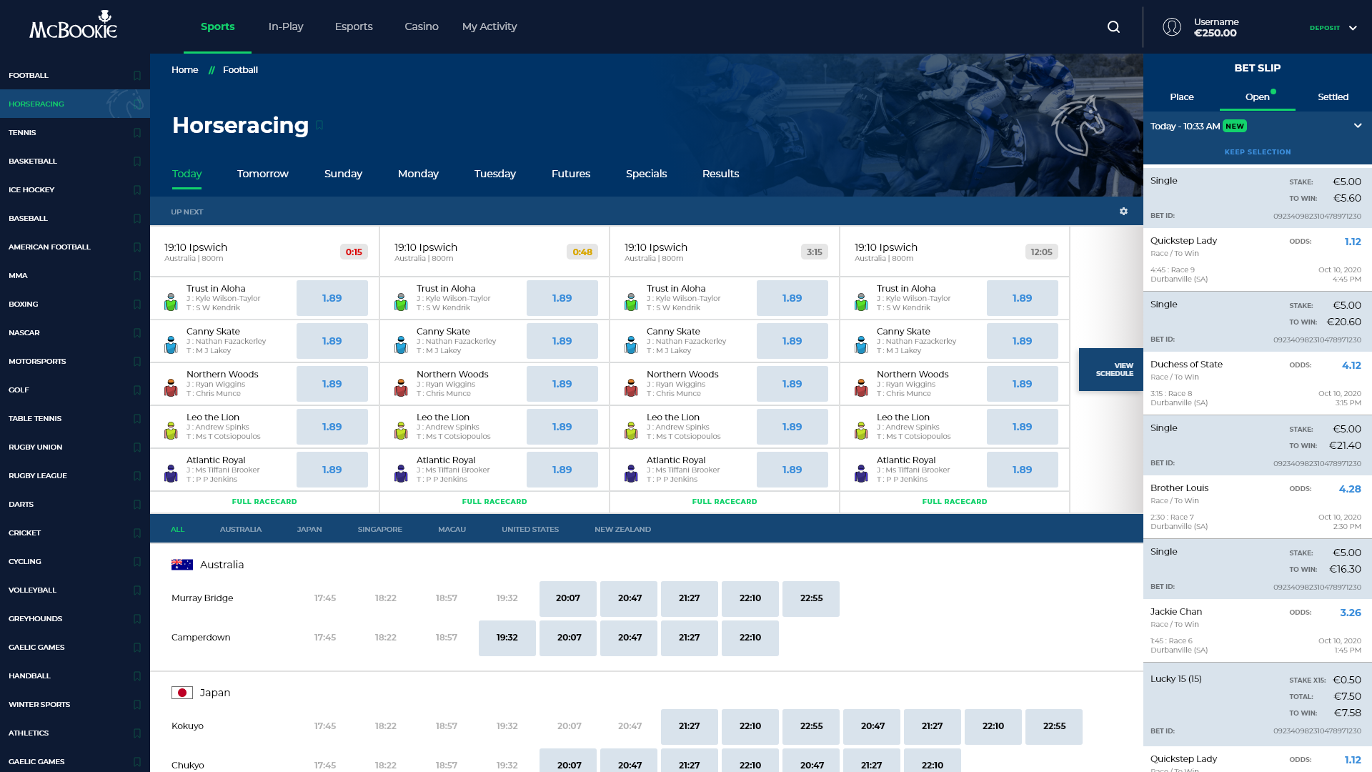
Example Theme: McBookie
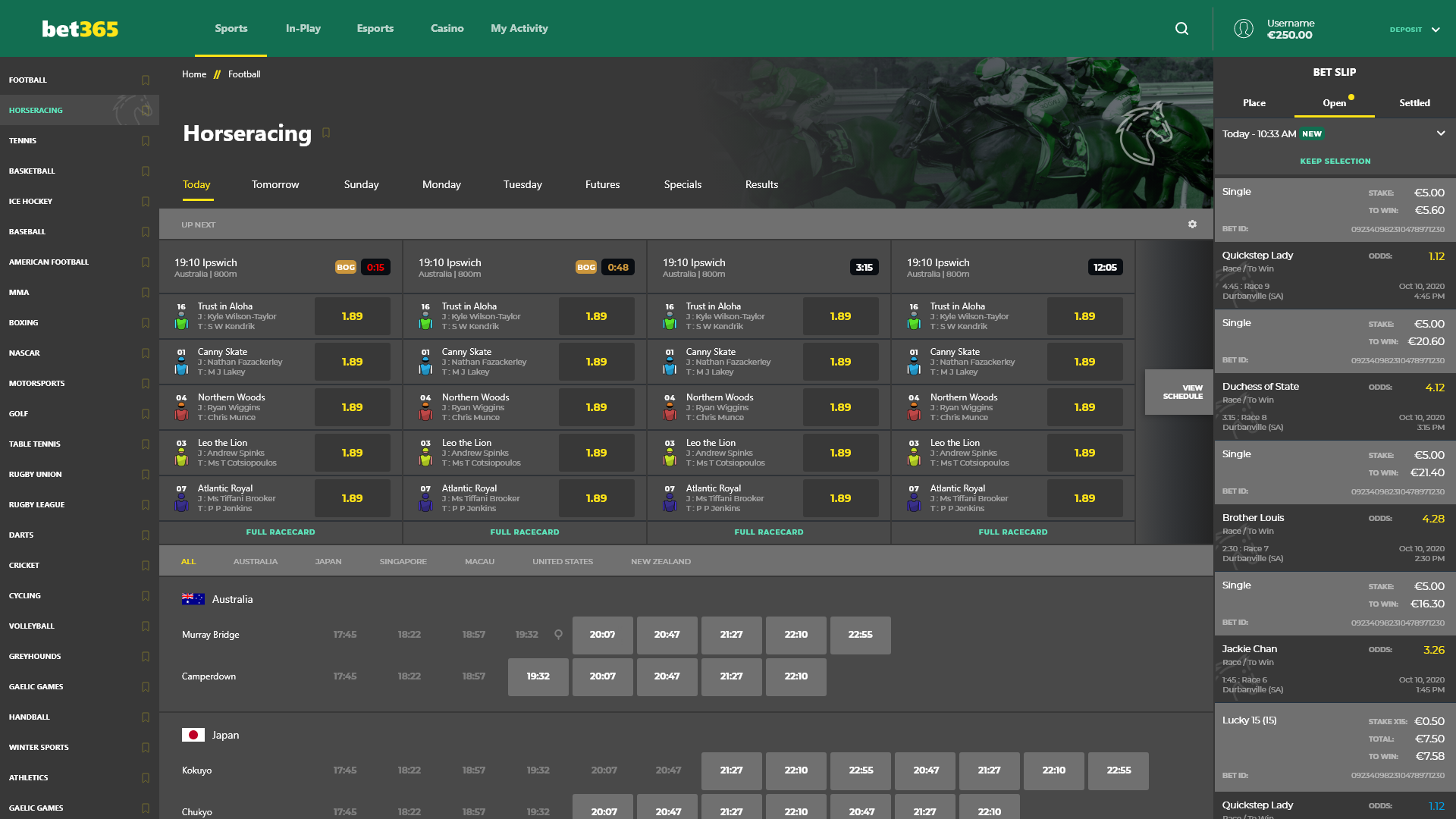
Example Theme: Bet365
Evaluating the Design
To evaluate the success of the design, we conducted the same initial focus group study with the same participants. Since most of our clients already had an existing userbase of casual and seasoned bettors, we wanted to make sure to prioritize those user groups. However we still wanted to attract new users, so in the design I’ve incorporated both direct and indirect assists to help guide and lower the learning curve of the app.
We obtained a successful result! Although we have discovered places where we can improve, we obtained a higher score than the initially tested sportbooks.
Importantly, we managed to appease our seasoned bettors and they generally scored our design about the same as Bet365. Our new user participants still felt a bit overwhelmed by the amount of information, but they appreciated the tooltips, legends, and felt that the user interface was perceptively more intuitive.
We found we took quite a few point losses due to colour contrast and font legibility, but we were able to alleviate these some of issues when we tested with an alternative theme.
The design was also demonstrated to some potential clients and was able to help secure a few of our future contracts.
Result
We have launched 5 whitelabel brands by the end of Q2 2022. The product is in a constant state of iteration, with the design team gaining live feedback from our sites to help inform future updates. Recently, the sportsbook alongside Chameleon platform was acquired by Betr for $10M CAD.

Project Showcase
Sports Lobby
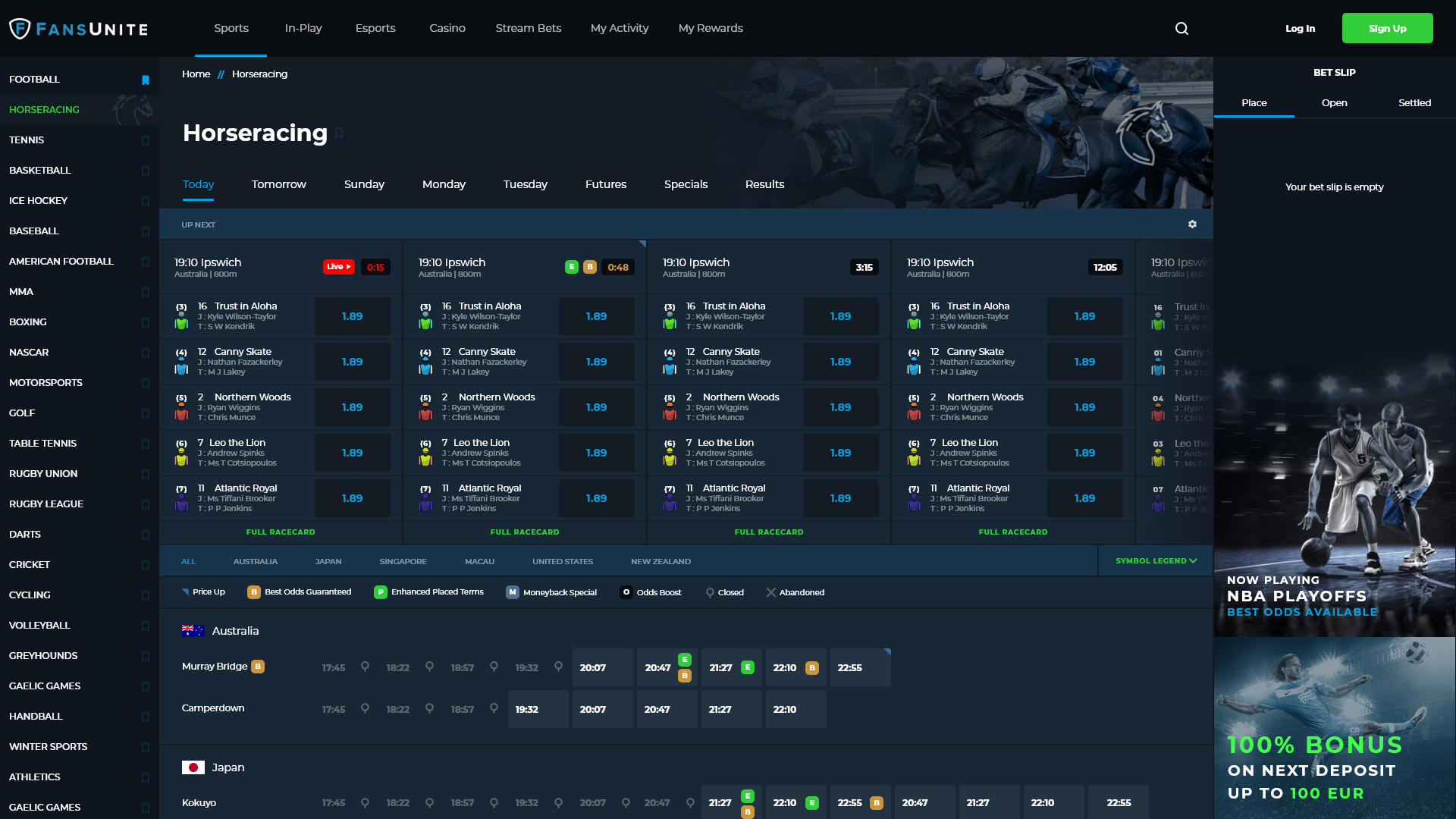
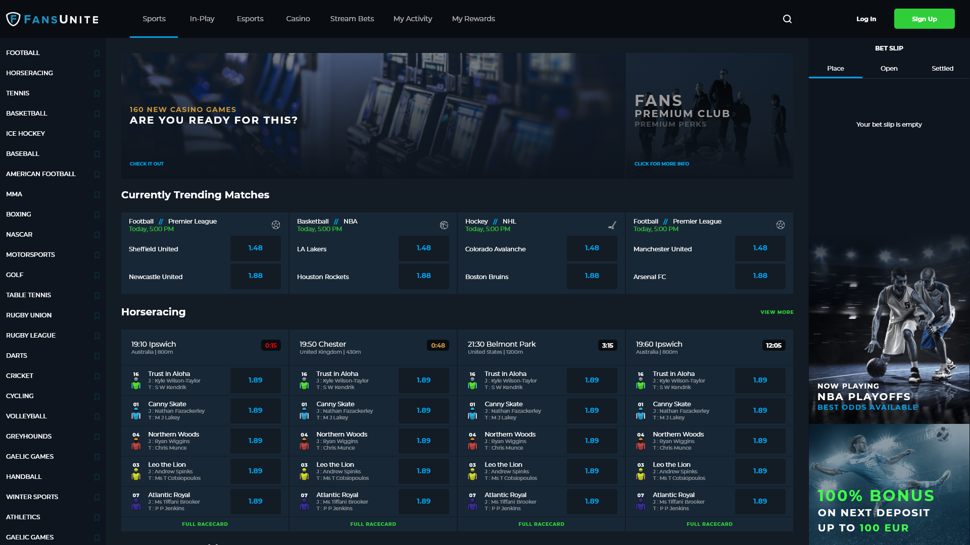
Horseracing
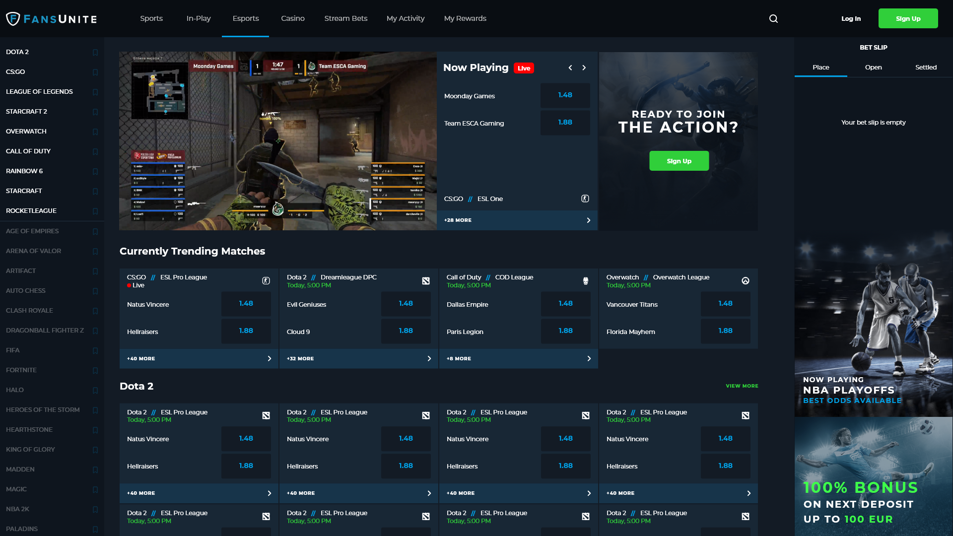
Esports Lobby
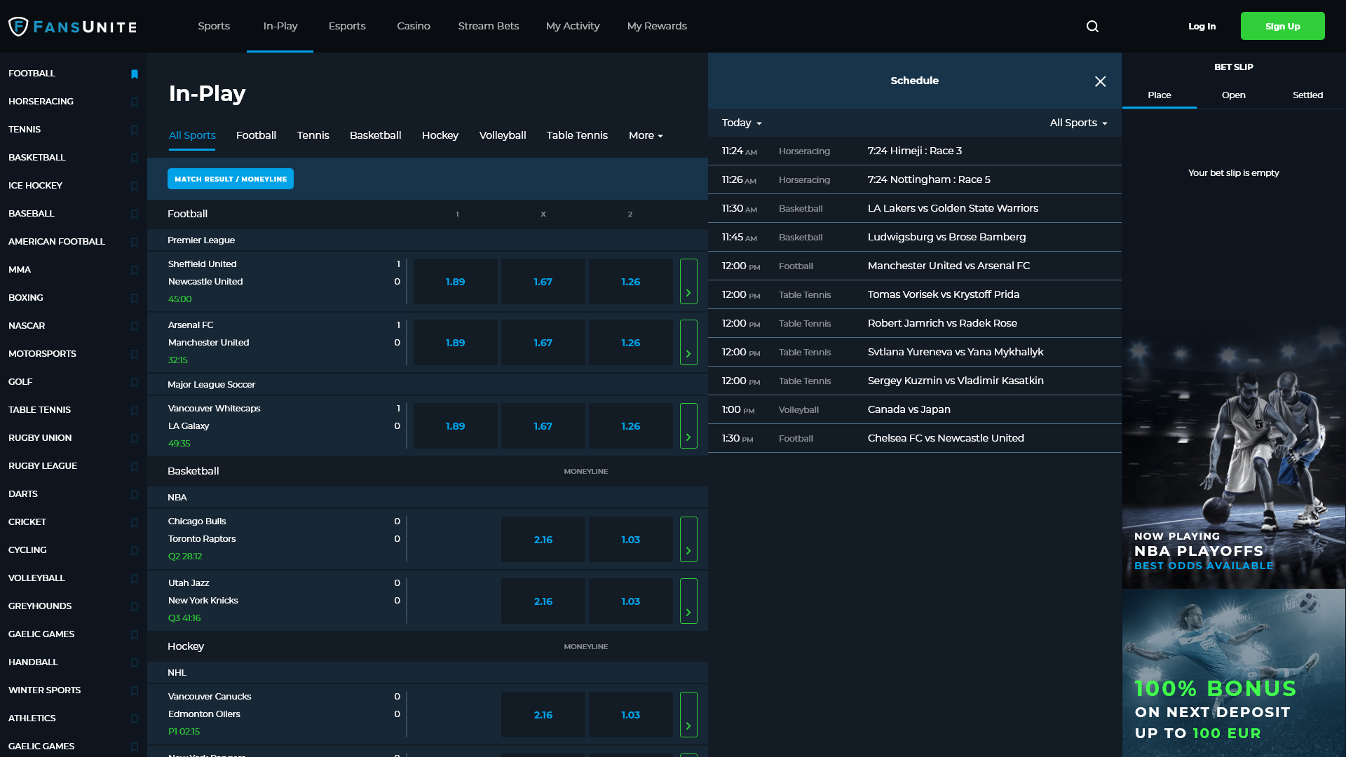
In-Play Lobby
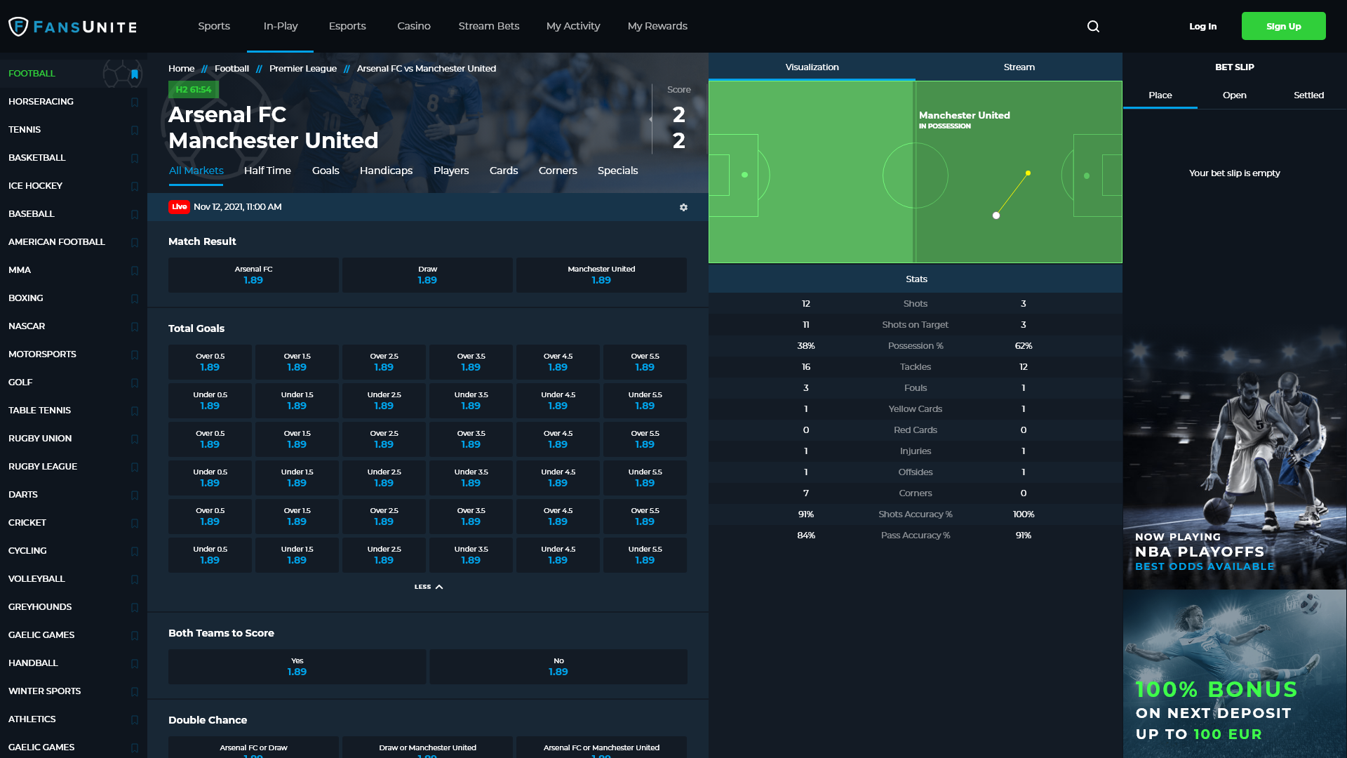
Match Page with Visualization
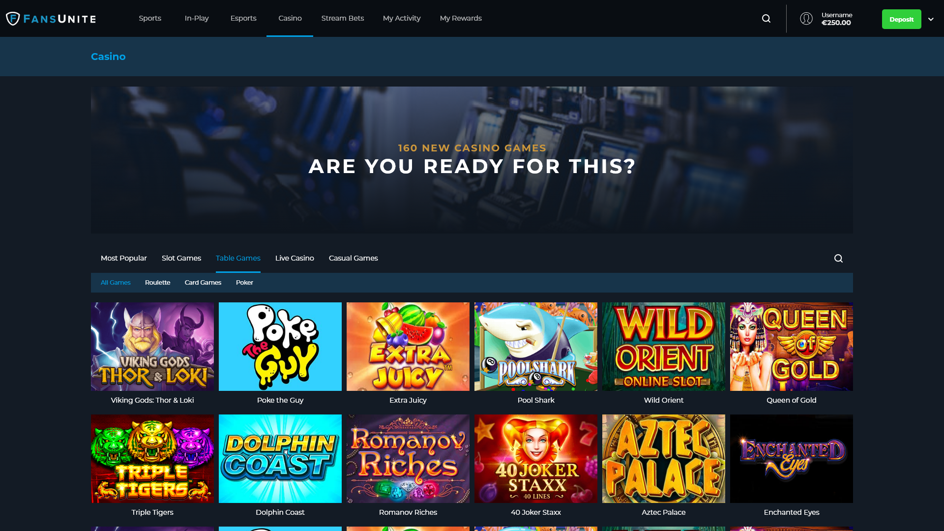
Casino Lobby
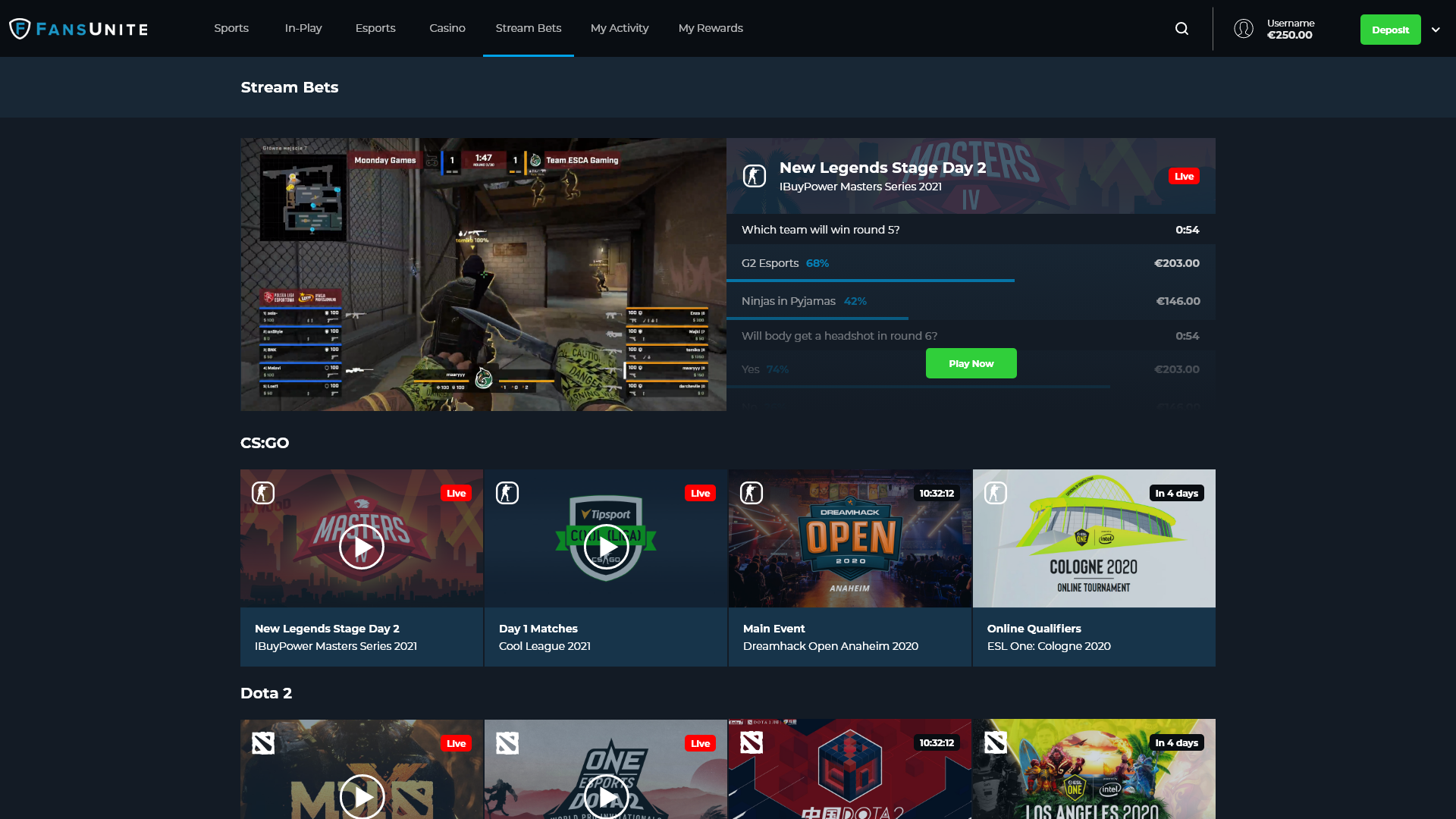
Stream Bets Lobby
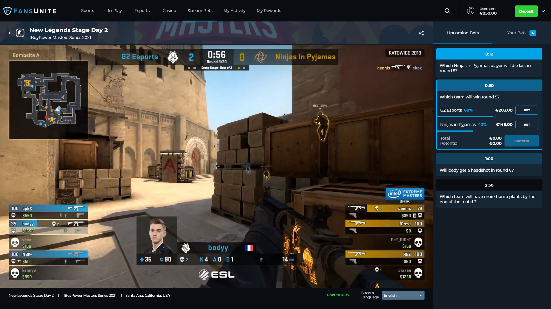
Stream Betting Event